The first thing which put me off after logging in to the kubuntu (9.10) desktop for the first time was the fonts. They are two problems I have with the default Kubuntu fonts (Well the first one is not much of a problem but personal taste.)
1: The default fonts The default font setup on Kubuntu Karmic is ok. But I wanted some better than ok, so I install the liberation fonts which has always served me well in the past (especially when I was a gnomie ![]() ) It comes as part of the Kubuntu-restricted-extra package.
) It comes as part of the Kubuntu-restricted-extra package.
sudo apt-get install ttf-liberation
Once installed you can change the system fonts by going to System-Settings/Appearance/Fonts and click Adjust all fonts then select Liberation Sans from the list. (I got the best appearance by using size eight) 
2: The fonts for gtk application are just way too fugly that it hurts the eyes. Plus they look very out of place from the rest of the KDE UI. Thankfully I was able to fix this issue by replacing the .fonts.conf in my home directory with this one file rename the .raw.txt file to .fonts.conf and place it you your home directory (remember that a file with a . (dot) in front is hidden in Linux. You can always view all hidden file in KDE with Alt and .(dot) keyboard combination) Once you have done this you can log out and login back for the changes to take effect. After applying this fix around you would notice a clear difference in the way gtk app fonts are displayed. The Fix makes fonts for gkt application to be very smooth and consistent with the rest of the KDE UI
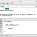
Before the fix

After the Fix

I will let you be the judge of that. You can also browse through other related articles on aoizora.org.
Hope someone finds this useful.